Pre-seeded crowdfunded real estate investment trust · 2026 · Building the full marketing, brand, web, and social media foundation ahead of a crowdsource funding launch.
2026 brand identity. SVG source files, pixel-perfect at any size, on any background.
Equitide is a vertically integrated real estate trust built on one idea: your money should do something good while it grows. Margin is deferred to exit instead of extracted during construction, so projects cost less to build, meaning better returns for investors and more attainable rents for tenants. When I joined at founding, the brand was a name and a concept. Everything else (identity, website, social presence, investor messaging, go-to-market) was mine to build.
The brief
"Build the brand that makes investors trust us with their money and communities want us in their neighborhoods, before we have a single completed building to show them."
Equitide has to win two audiences at once: investors who need to trust a return, and communities who need to trust the mission. The name (equity plus tide) gave the answer: the wave-form mark, explored across Trustworthy, Home Developer, and Disruptor postures before landing between the first and last. The June 2026 system update retired the original Navy/Cream/Gold palette. The new system (Burgundy, Brand Green, Deep Green on White/Stone grounds) is built for a regulated offering, with WCAG-verified contrast across all pairings.
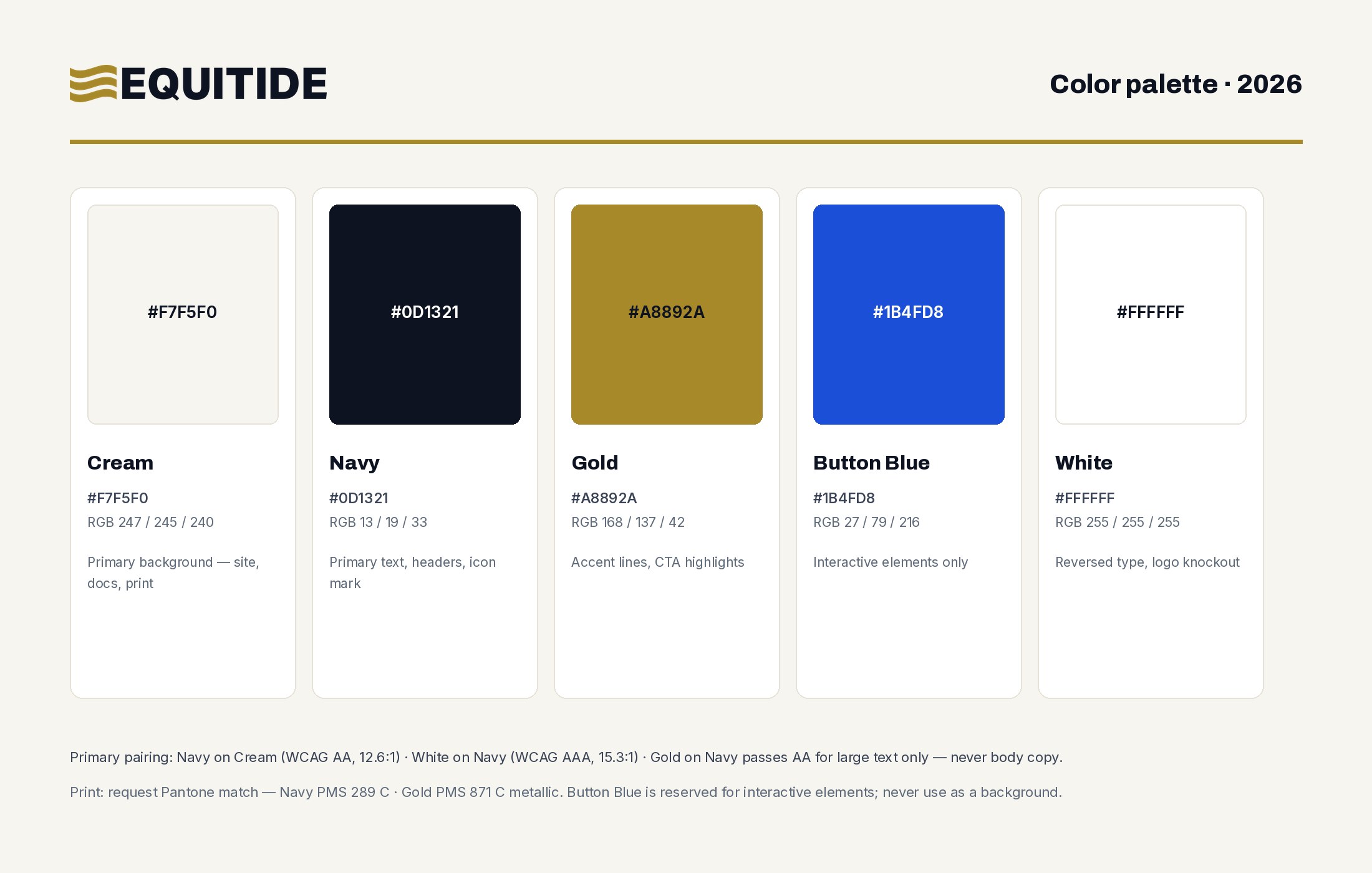
Explore the full Equitide design system
The complete brand system as a living reference document: color with WCAG ratings, all twelve logo variants, the typographic scale, UI components, spacing, and the voice and tone rules that govern every piece of Equitide communication.
View the design system →A system only earns its keep when it produces consistent work across every surface. These pieces (web, print, and paid social) are built entirely from the tokens above: the same palette, the Inter and IBM Plex type stack, the logo variants matched to their backgrounds, and the compliance rules that put a labeled disclosure on every return figure.
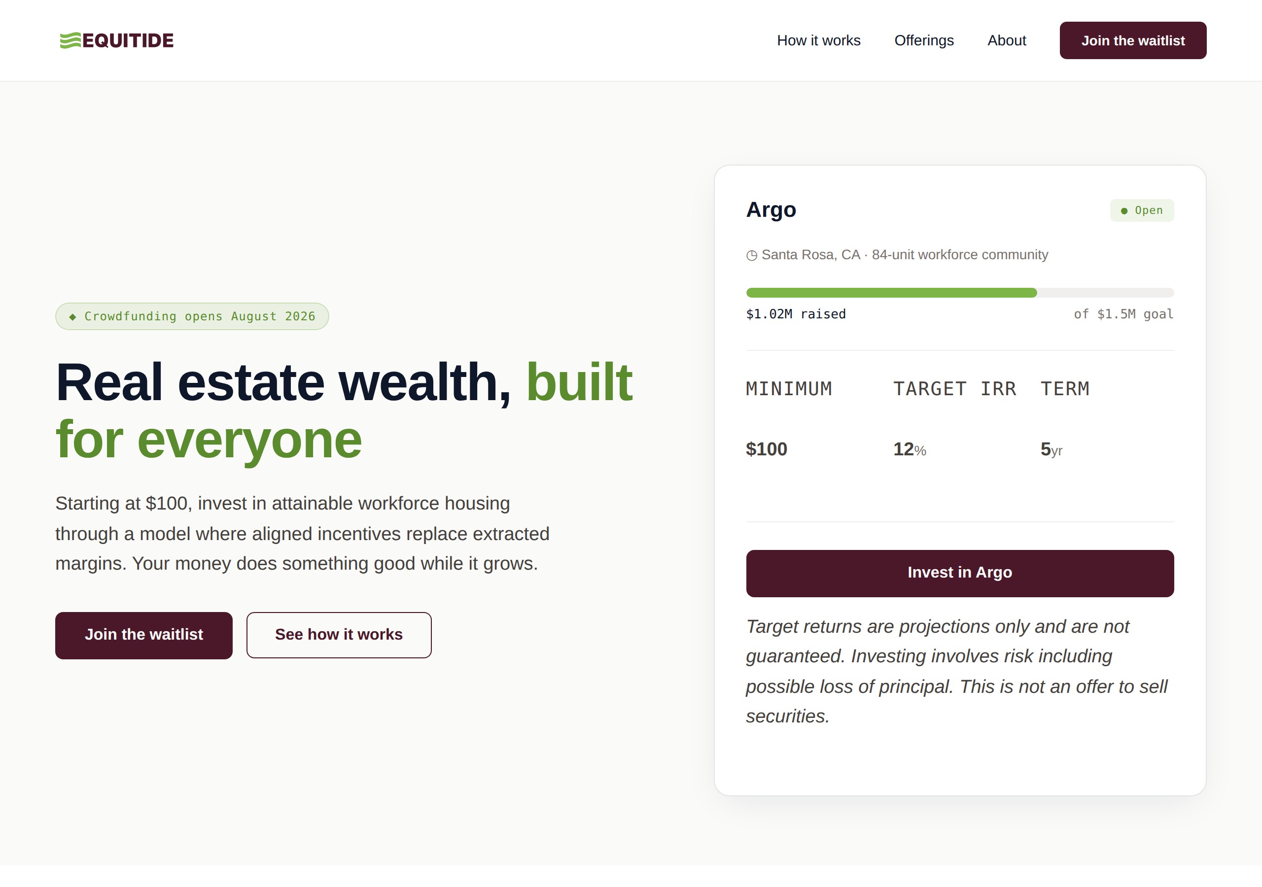
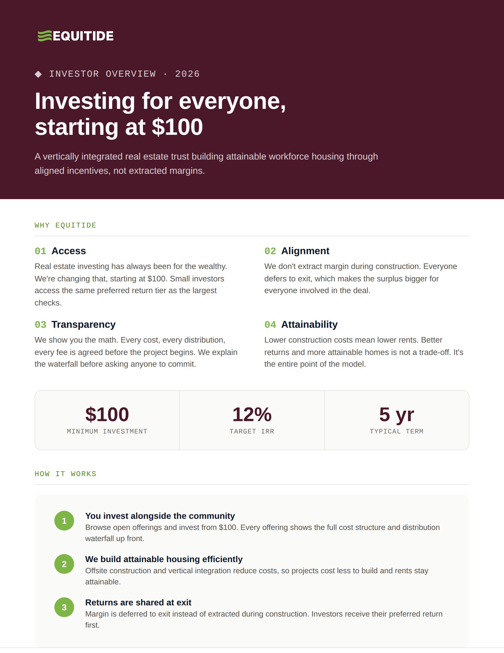
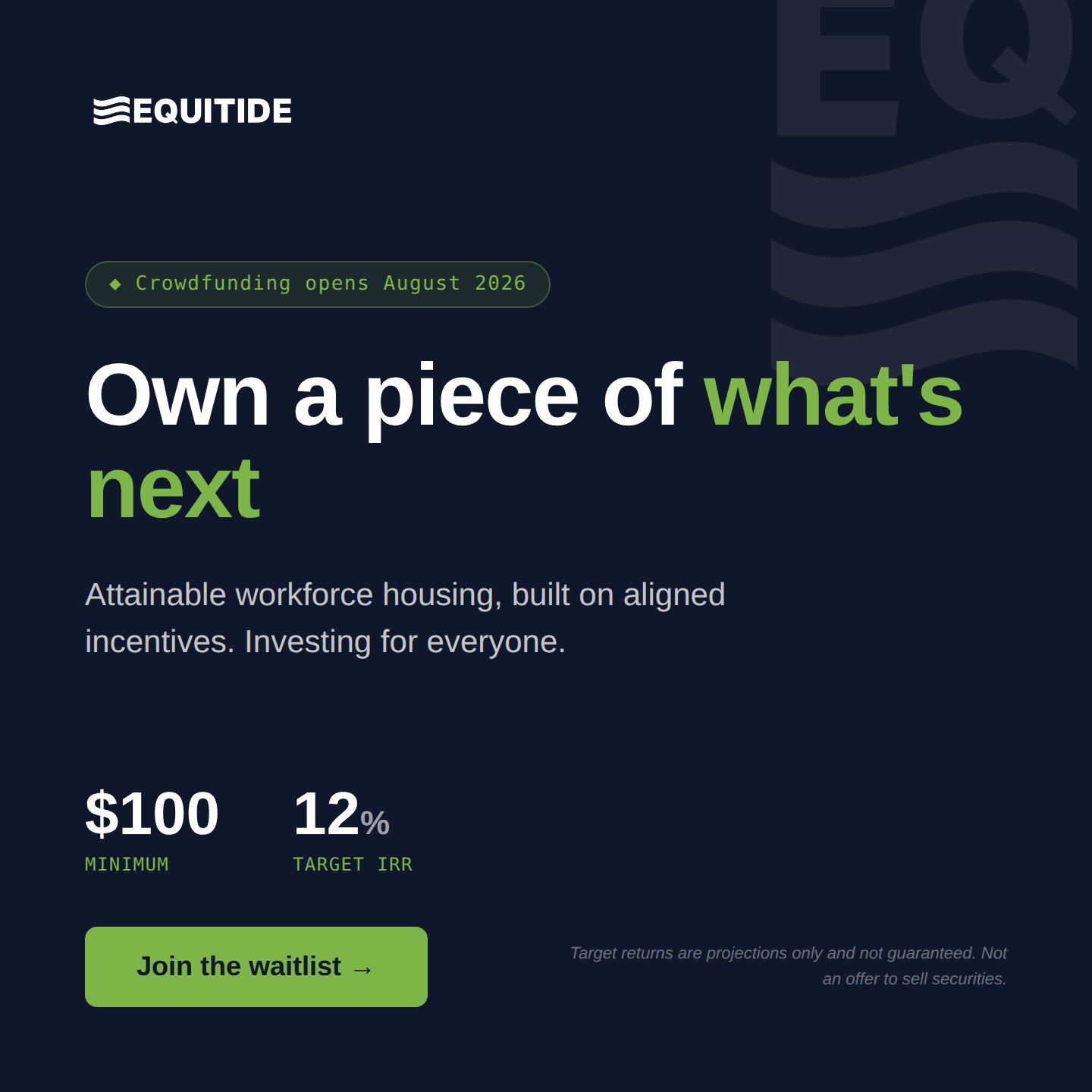
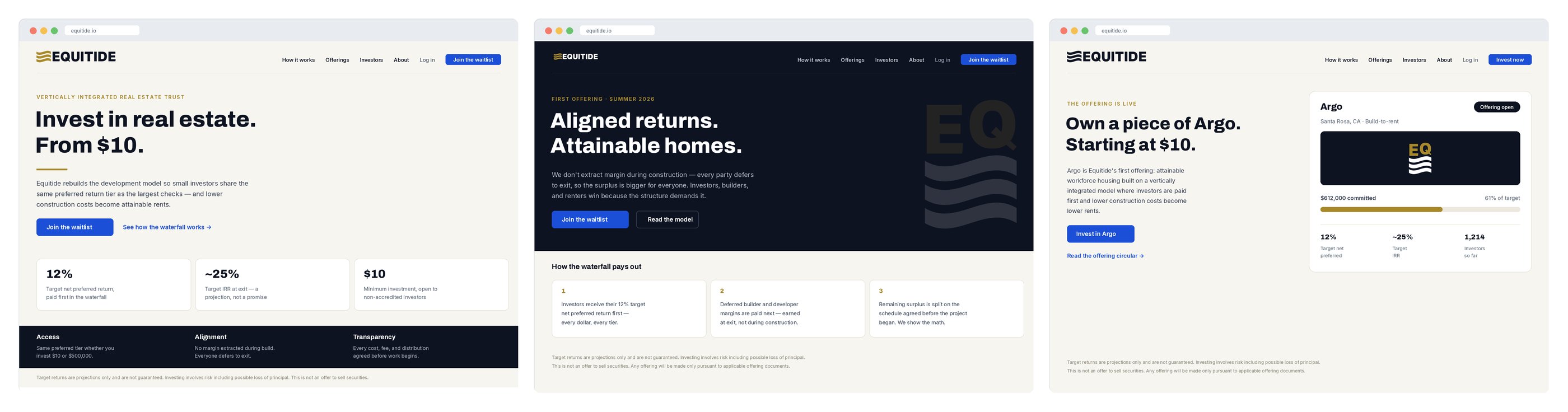
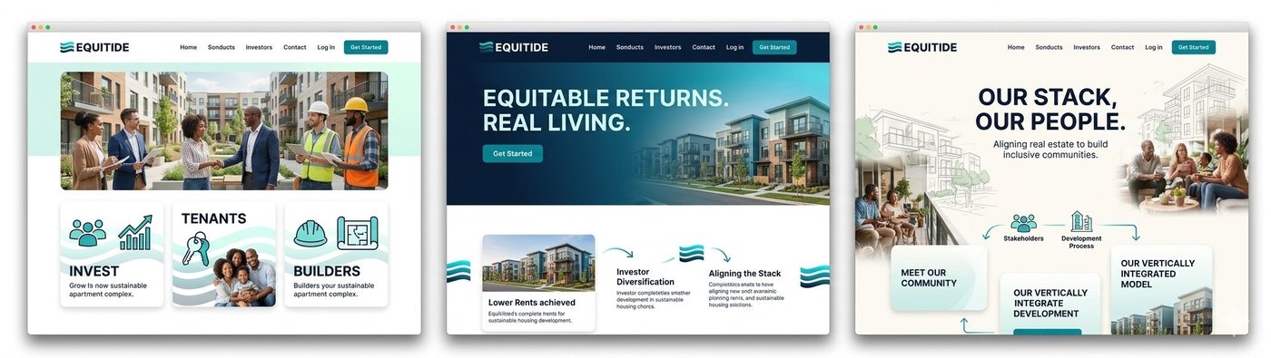
The site serves investors, future residents, and community partners from one front door, under securities-offering rules most brand sites never touch. Every return figure is a labeled target; the disclosure travels with every page. The live site at equitide.io carries the company's first offering, opening summer 2026.
I scripted, directed, and produced the WeFunder campaign launch video: a 90-second cut delivered through HeyGen with Canva graphics. Twelve script iterations to land the right register: personal and conversational, not pitch-deck formal. Posted to Garth's personal LinkedIn first, with the company page resharing, to let pre-launch trust attach to the founder before the raise.
Equitide WeFunder Campaign Launch Video · Garth Wells, CEO · Scripted, directed, and produced by Dana Constance · HeyGen AI video · Canva graphics · 2026
How a two-person team ships like five: the Equitide content engine
The brand is built. Keeping it alive across five channels every week is a second discipline. See the AI-accelerated workflow behind the social presence, the weekly content engine, and a 600% follower lift in four weeks.
View the content engine case →Live
Brand system, site, and social all active at equitide.io
12
Logo variants across the full identity system
Aug 2026
Crowdfunding campaign opens to investors
WCAG
Verified contrast across every color pairing
This case study will expand as the brand and launch develop. Check equitide.io for the live site.