Email Marketing Design · Photo Curation
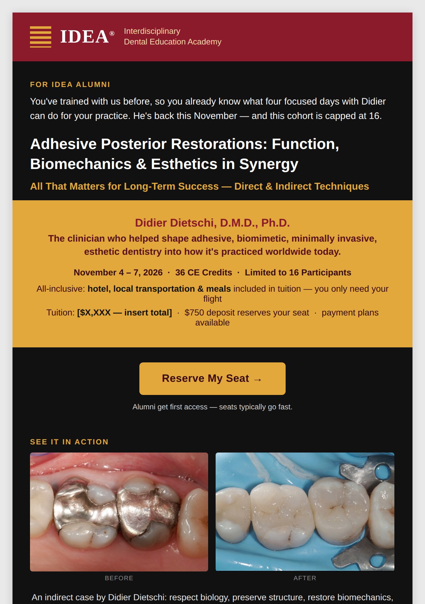
Alumni-recruitment email, IDEA's November 2026 course with Didier Dietschi. Built inside IDEA's existing maroon-and-gold brand system.
An alumni-recruitment email for a four-day CE course taught by Didier Dietschi, one of the clinicians who helped define modern adhesive dentistry. The audience already knows IDEA and already knows Didier, so the job wasn't introducing anything, it was reminding a warm list why this specific cohort, capped at 16 seats, was worth reserving before it filled.
I was handed a batch of real photos, unsorted and uncaptioned: a patient's failing amalgam restoration, several stages of an indirect restoration case at different points in treatment, a chairside teaching moment, and a group shot of the current cohort. None of it was styled for marketing. Some of it wasn't usable at all.
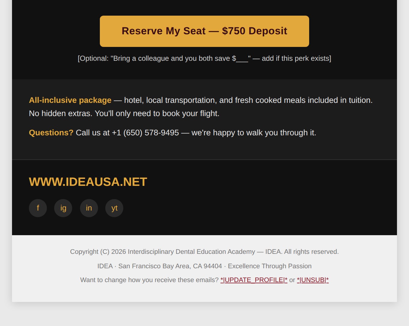
Built in inline-safe HTML and CSS to survive real email clients, not just a browser preview. IDEA's existing maroon (#8b1a2b) and gold (#e3a83b) system carries the banner and the pricing block; everything else drops onto black so the case photography, the only full-color imagery in the email, is the thing your eye lands on. Two identical CTA buttons bracket the case study and the proof section so the ask is never more than one scroll away.
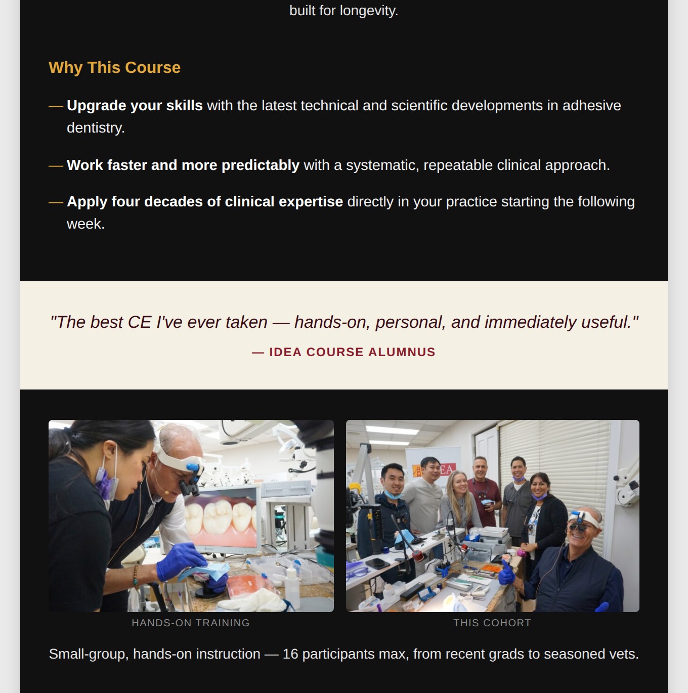
This wasn't a from-scratch brand build, it was taking someone else's raw material, real clinical photos with no art direction behind them, and making editorial judgment calls about which four told the story and which two didn't. That's a different muscle than concepting a campaign, and it's the one that gets used every time a client hands over a folder of unsorted assets and needs something sendable by Friday.