Brand Identity · Healthcare
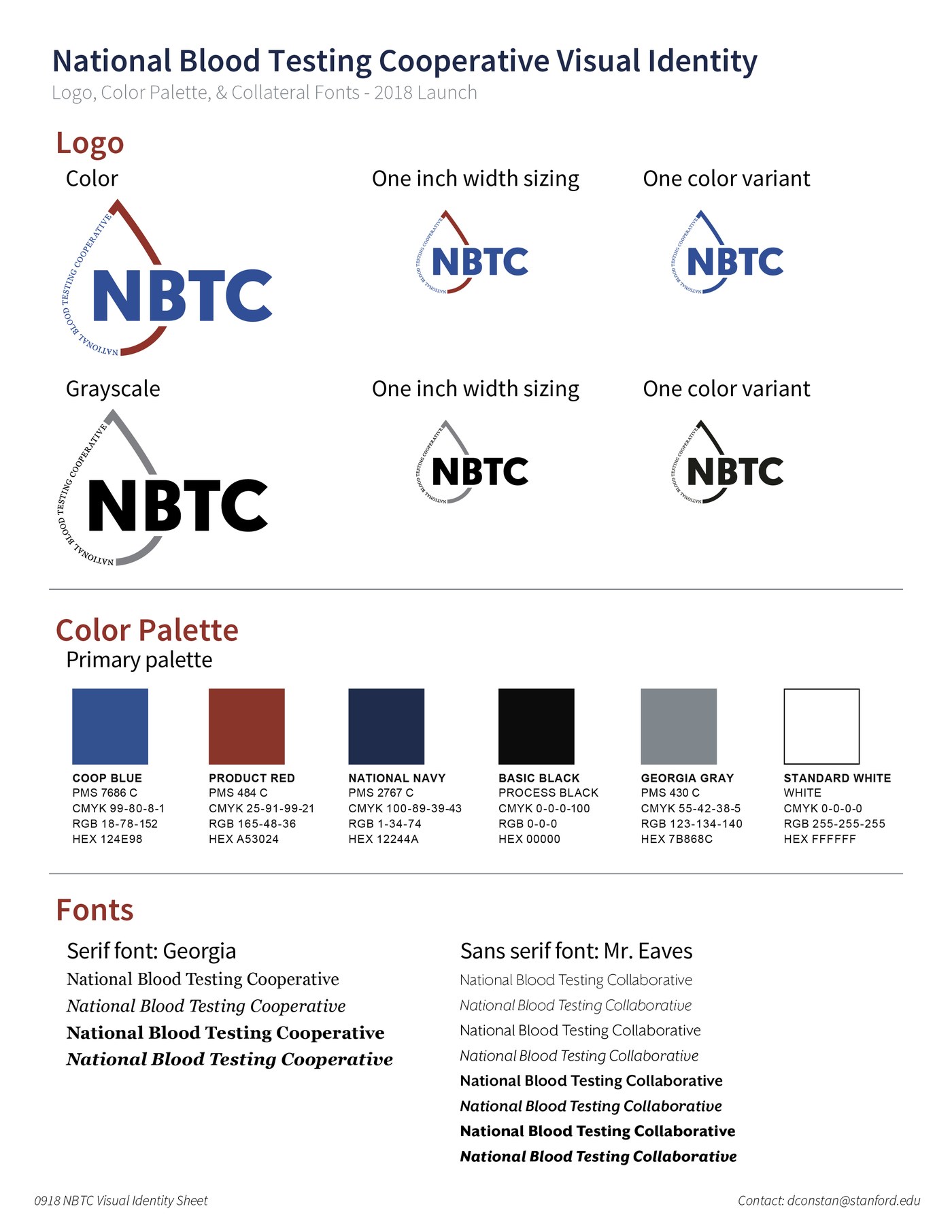
NBTC Visual Identity Sheet, logo system (color, grayscale, one-color variants, sizing), 6-color palette with full PMS/CMYK/RGB/HEX specs, and font specification · 2018 Launch
The National Blood Testing Cooperative launched in 2019 as one of the first cooperatives formed specifically for blood testing needs: nine independent blood centers pooling resources to take control of their testing costs and quality without ceding ownership to a third-party vendor. It was a genuinely novel organizational model in a conservative industry.
The identity challenge was precise: a brand that nine peer organizations could all feel ownership over, not one member's colors, not one member's voice. It needed to signal scientific credibility without feeling clinical, cooperative values without feeling soft, and independence without alienating the blood banking establishment it was recruiting from.
The NBTC mark is built around a blood drop badge, the central symbol of blood banking, reframed as a seal of collective ownership. The circular wordmark wraps the badge, reinforcing the sense of an organized alliance. The bold sans-serif "NBTC" lettermark anchors it with authority.
The color system does the strategic lifting. Coop Blue and National Navy ground the brand in scientific trust. Product Red acknowledges the blood banking industry without letting clinical red dominate. Georgia serif for display type gives gravitas; Mr. Eaves sans-serif for body keeps it accessible, a pairing that communicates serious science explained plainly.
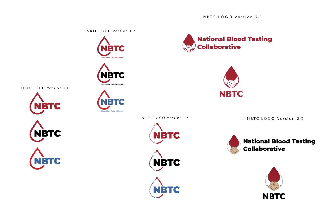
The identity was delivered as a full brand standards document covering all logo variants, color values, and typography specifications, giving the organization everything needed to maintain brand consistency without an in-house creative team.


18
Member blood centers, up from 9 at launch
1.3M+
Blood donor units tested annually
6+
Years in active use nationally
An identity built for a brand-new cooperative needed to earn trust from nine peer organizations simultaneously, and any hint of one member's aesthetic preferences would have undermined the collective ownership model. The brand has held through the organization's expansion from regional startup to national cooperative, through COVID, through adding labs in Atlanta and the Bay Area, and through doubling its membership. That it still runs unchanged is the proof.