In 2013, I art directed and produced two simultaneous high-stakes government RFP responses — one for the City of Oakland, one for the Monterey Peninsula — both competing for $1B+ municipal waste franchise contracts. Nine volumes for Oakland alone, a parallel multi-volume set for Monterey, both under the same government formatting constraints and the same deadline pressure. For Oakland I art directed a group of Oakland resident photographers — including Ed Mestre, an Oakland resident and retired OUSD high school teacher — and built the "We Are Oakland" campaign around an Oaklandish-designed logo and community portraiture. For Monterey I was the sole photographer — all tab images, employee portraits, and landscapes. Oakland was ranked #1 by staff evaluators, lost politically, then won via lawsuit. Monterey lost the evaluation cleanly to a better competitor. Two cities, one designer, two honest outcomes.
// The stakes
In 2012, the City of Oakland issued a request for proposals to restructure its entire zero waste services contract — a $1 billion-plus municipal franchise covering garbage, recycling, and organics collection for every residence and business in the city. Waste Management of Alameda County had served Oakland for over a century. This was not a routine renewal. It was an open competition, and losing it meant losing everything.
The political environment was hostile. Oakland had a long history of antagonism toward WM as a symbol of corporate consolidation in a historically worker-owned industry. The "We Are Oakland" approach was designed to answer that directly — not with corporate boilerplate, but with Oakland's own cultural language turned back toward the evaluators.
"Design a 9-volume RFP response that proves Waste Management isn't just a Texas corporation — it's Oakland's company. Show the history, the people, the commitment, and the future. Make it impossible to dismiss as a form submission from a multinational."
At the same time as Oakland, WM was competing for franchise contracts across the entire Monterey Peninsula — Carmel, Seaside, Pacific Grove, Marina, Sand City, Del Rey Oaks, and Pebble Beach. A separate set of proposals, same document architecture and design system, different community story. Where Oakland needed a cultural campaign, Monterey needed a different argument: WM as a deeply embedded local service partner in a region it had served for decades. The "We Are Oakland" campaign had no equivalent here — the strategy was operational credibility and community presence, expressed through Monterey-specific photography and Peninsula landmarks.
// The document architecture
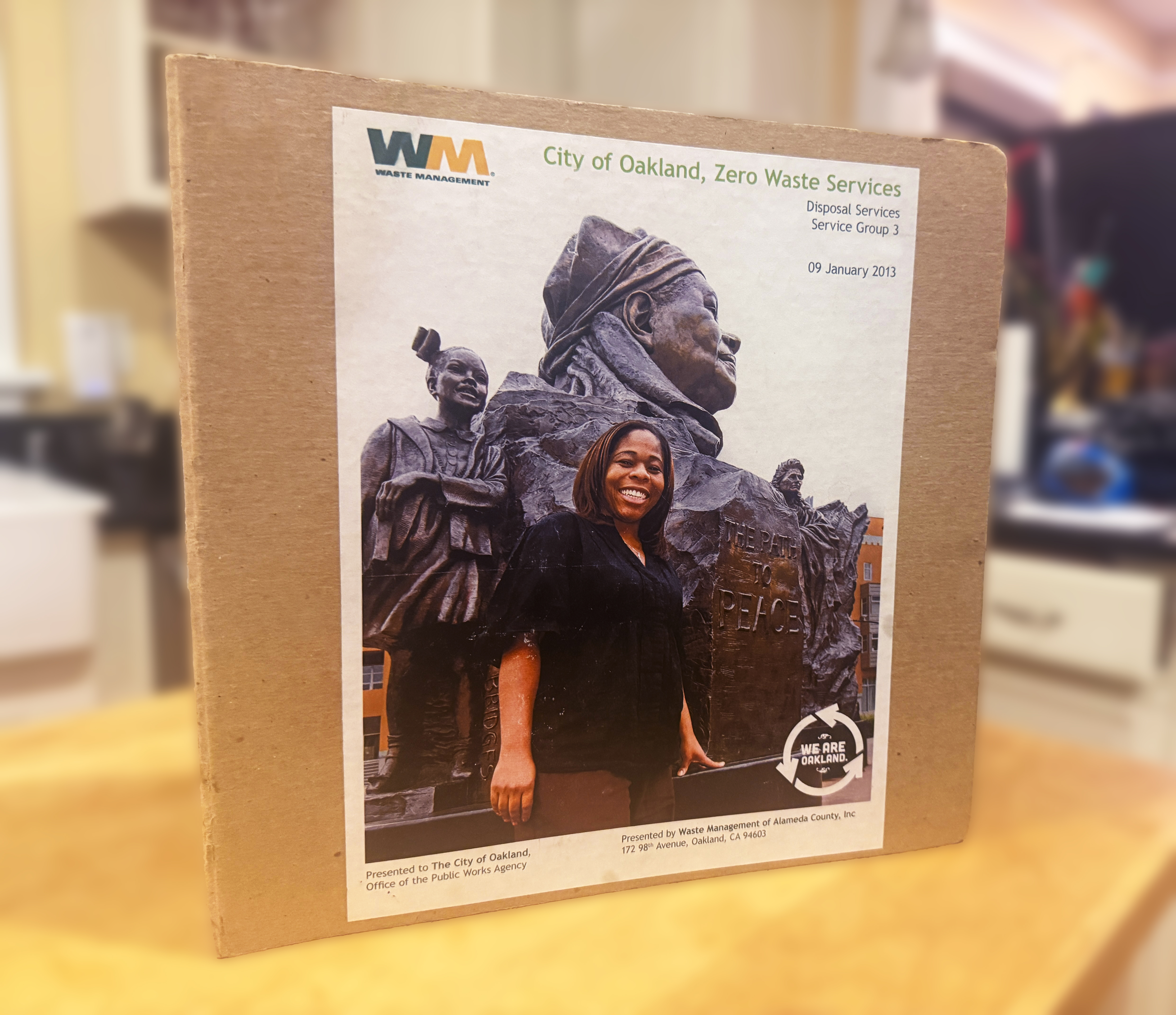
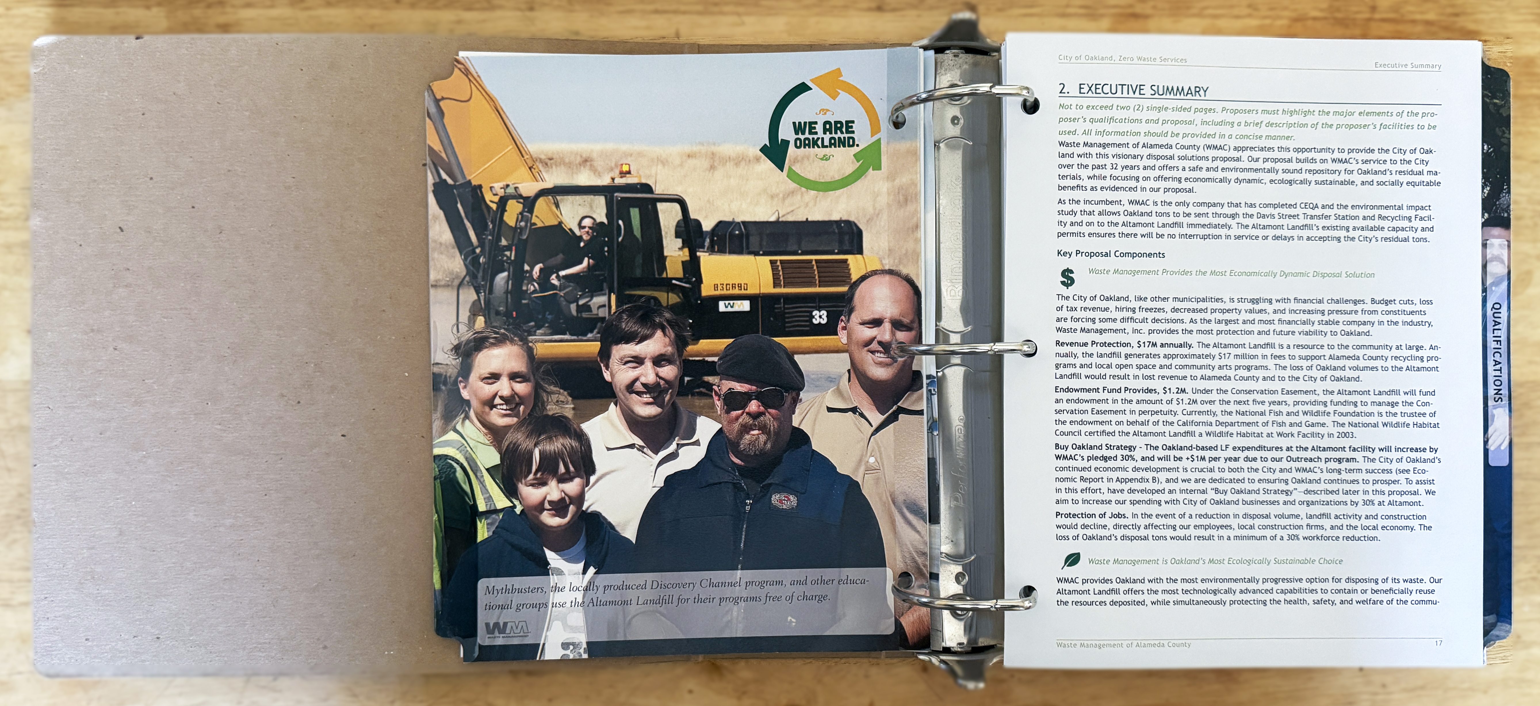
The Oakland response was structured across nine volumes — each a 3-inch recycled cardboard binder, each addressing a separate service group or technical requirement. Every volume had to conform to strict government formatting standards: page counts, margins, tab structure, appendix labeling, typeface restrictions. A single non-conforming page could have disqualified the entire response.
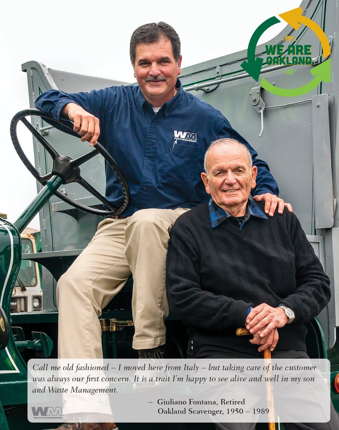
Inside those constraints, the "We Are Oakland" design layer ran through every volume — full-bleed community photography on the tabs, the Oaklandish-designed We Are Oakland logo anchoring every spread, employee portraits in place of stock photography. The WM brand grid gave the document its authority. The Oakland campaign gave it its soul.
// Photography & tab design — Oakland
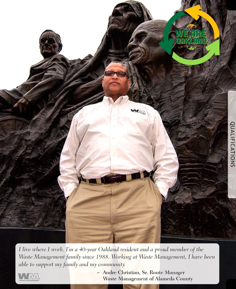
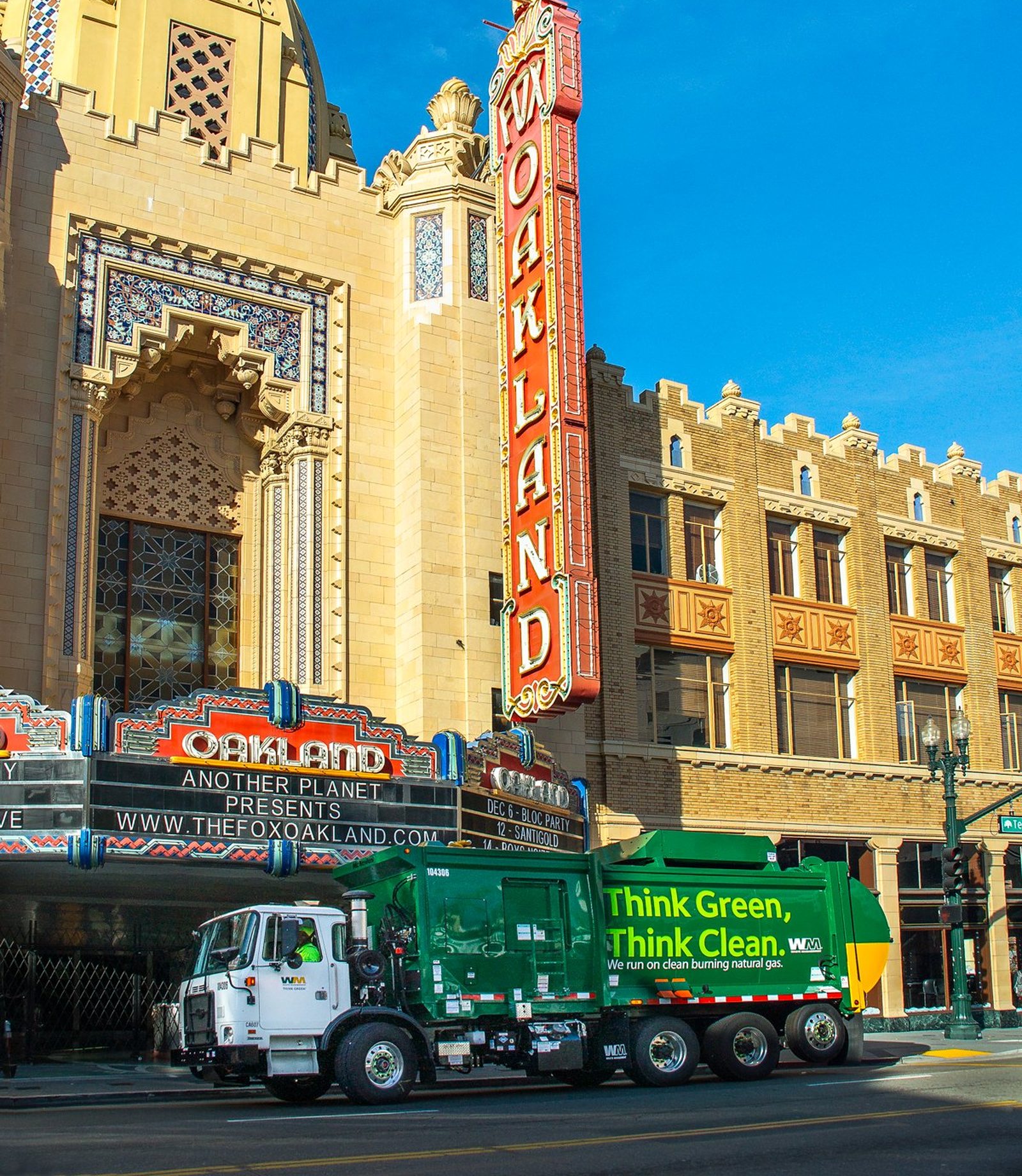
The Oakland photography was shot by a group of Oakland resident photographers — locals who knew the city from the inside, not hired guns shooting on location. Ed Mestre led the portrait work: an Oakland resident himself and a retired Oakland Unified School District high school teacher, Mestre brought an authenticity to the employee portraits that no outside photographer could have matched. Subjects were photographed before City Hall, at work facilities, and in neighborhoods they'd lived in for decades. No studio lighting, no neutral backgrounds, no corporate headshots. The tab photographs were the most visible design decision in the submission: each tab was a full-bleed image — the first thing evaluators saw when they opened a volume — ranging from archival sepia (a horse-drawn Oakland Scavenger wagon, 1910s) to multigenerational family stories like the Fontana tab, to golden-hour urban landmarks like the Fox Oakland Theater with a WM CNG truck in the foreground.
// We Are Oakland — the campaign
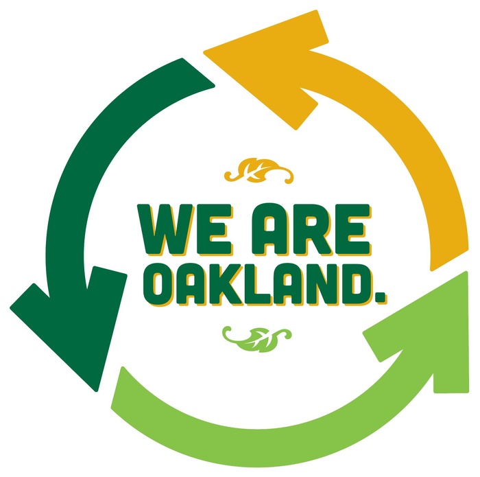
The logo was designed by Oaklandish — the Oakland-born clothing brand whose identity is inseparable from the city's cultural self-image. Three recycling arrows in Oakland A's green and gold with decorative Oaklandish leaf details. It was a deliberate use of Oakland's own design language: not WM's brand, but Oakland's, placed inside a WM proposal.
The logo appeared identically placed in the upper right corner of every tab spread across all nine volumes. It ran on the proposal cover. It anchored the We Are Oakland narrative section. The consistency wasn't accidental — it was a visual argument that WM had earned the right to use that symbol.
// Two cities, one window
The Oakland and Monterey Peninsula proposals were produced in the same 2013 submission window — the same document architecture, the same WM brand grid, the same production standards, but two entirely different community narratives built inside them. Oakland needed a cultural campaign built around historical belonging and political identity. Monterey needed something quieter and more operational: proof of deep local roots in a coastal community with a strong environmental identity.
// The production reality
Both submissions were produced under the same deadline pressure. Nine volumes for Oakland, a parallel multi-volume set for Monterey, each with strict government formatting requirements, legal language, financial tables, technical specifications, and dozens of supporting appendices. The design work — photography selection, layout, tab production, cover design, print coordination — ran concurrently across both cities. The deeper skill it required was knowing when to follow brand standards and when to bend them. The WM grid and color system gave each document its authority. The community layer — Oakland's cultural campaign, Monterey's environmental identity — gave each its soul.
// Photography — Monterey (sole photographer)
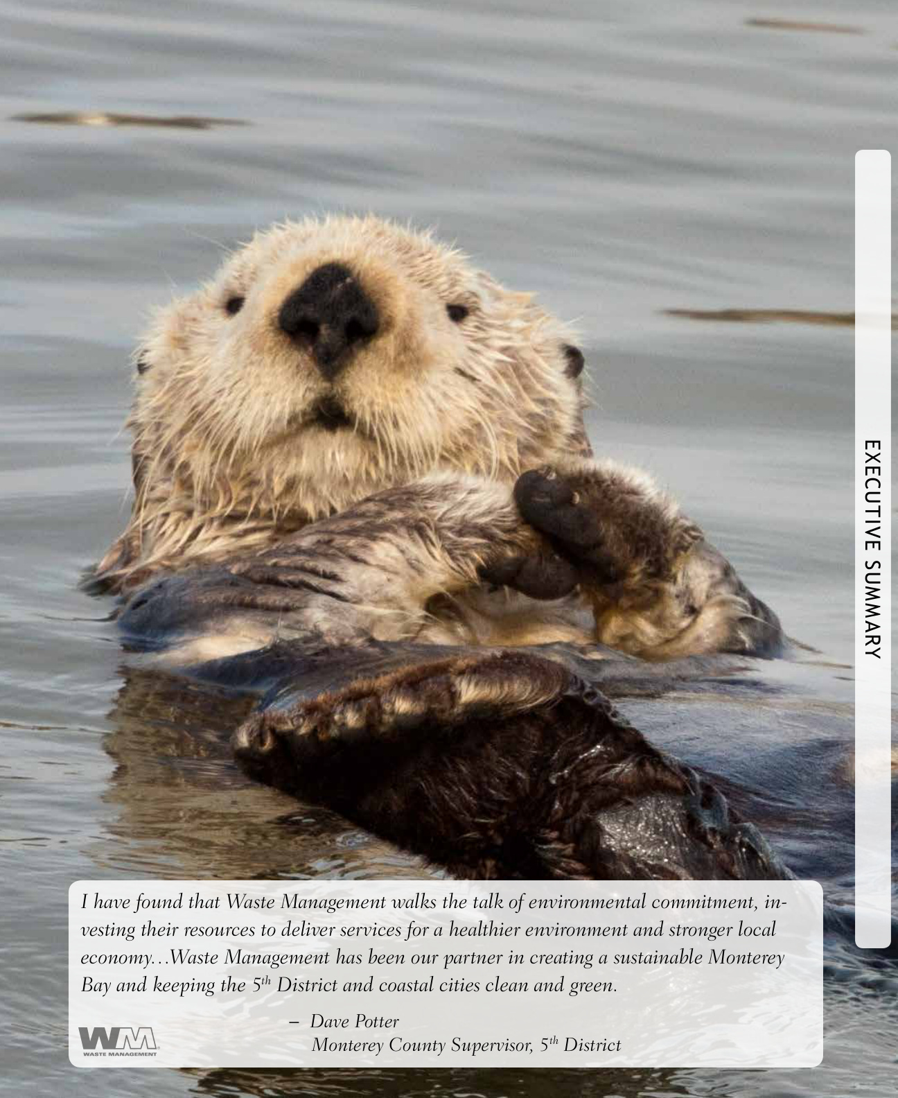
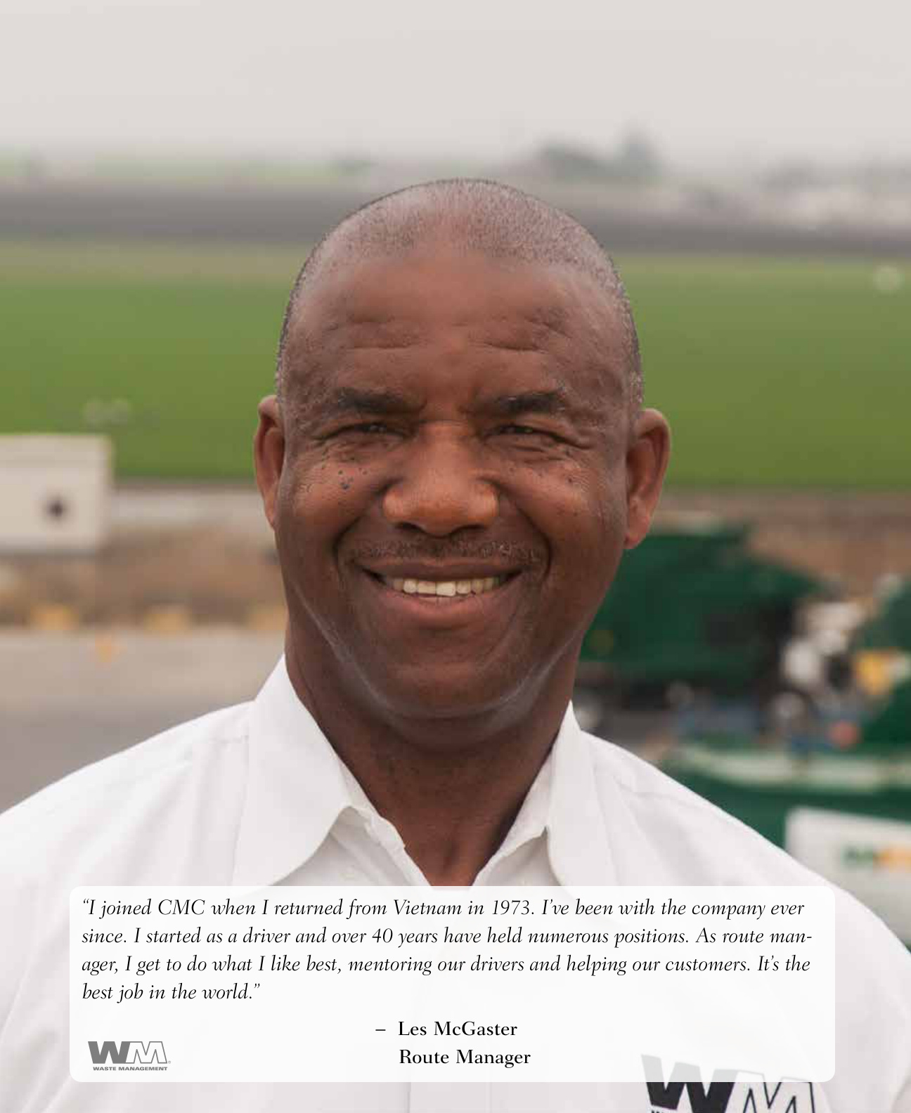
All Monterey tab photography was shot by Dana Constance — employee portraits, facility photography, community landscapes, and wildlife. The tab system carried over from Oakland: full-bleed photography, one image per tab, quote overlaid in the lower third. But the visual register was completely different. Oakland was urban and political. Monterey was coastal and ecological. The opening tab was a sea otter floating in the bay. The employee stories shifted from political belonging to generational roots: fishing families, Vietnam veterans, 31-year CMC employees.
// The outcome — both cities
Ranked #1. Overturned. Won in court.
The staff evaluation ranked WMAC #1 across all three service groups. In August 2014, the City Council voted 7–1 to award the contract to California Waste Solutions, overriding the staff recommendation. WM filed suit in Alameda County Superior Court and launched a voter referendum drive. Mayor Jean Quan brokered a resolution in September 2014 — WMAC was awarded garbage and organics. WM began service July 1, 2015.
Lost the evaluation. No legal action.
The MRWMD technical advisory committee recommended GreenWaste Recovery over WM for all seven Peninsula cities. One by one, every city followed — Carmel, Seaside, Pacific Grove, Marina, Sand City, Del Rey Oaks, Pebble Beach. WM retained only unincorporated Monterey County. No lawsuit, no referendum. GreenWaste won the evaluation on its merits. Sometimes a well-designed proposal meets a better competitor.
// Timeline
// What this body of work required
2
Simultaneous RFP responses, same 2013 window
9+
Volumes produced per city, strict government deadlines
100%
Monterey tab photography by Dana Constance
7
Monterey Peninsula cities targeted across one design system
These were two of the most contested municipal waste procurements in Northern California in that decade. One proposal won in court after losing politically. One lost the evaluation cleanly to a better-positioned competitor. The honest portfolio story is that great proposal design is necessary but not sufficient — it can win an evaluation, but it cannot override entrenched politics or a sharper competitor. That's what both pieces of work were for, and what they ultimately proved.